Our Music Video


Our Music Video

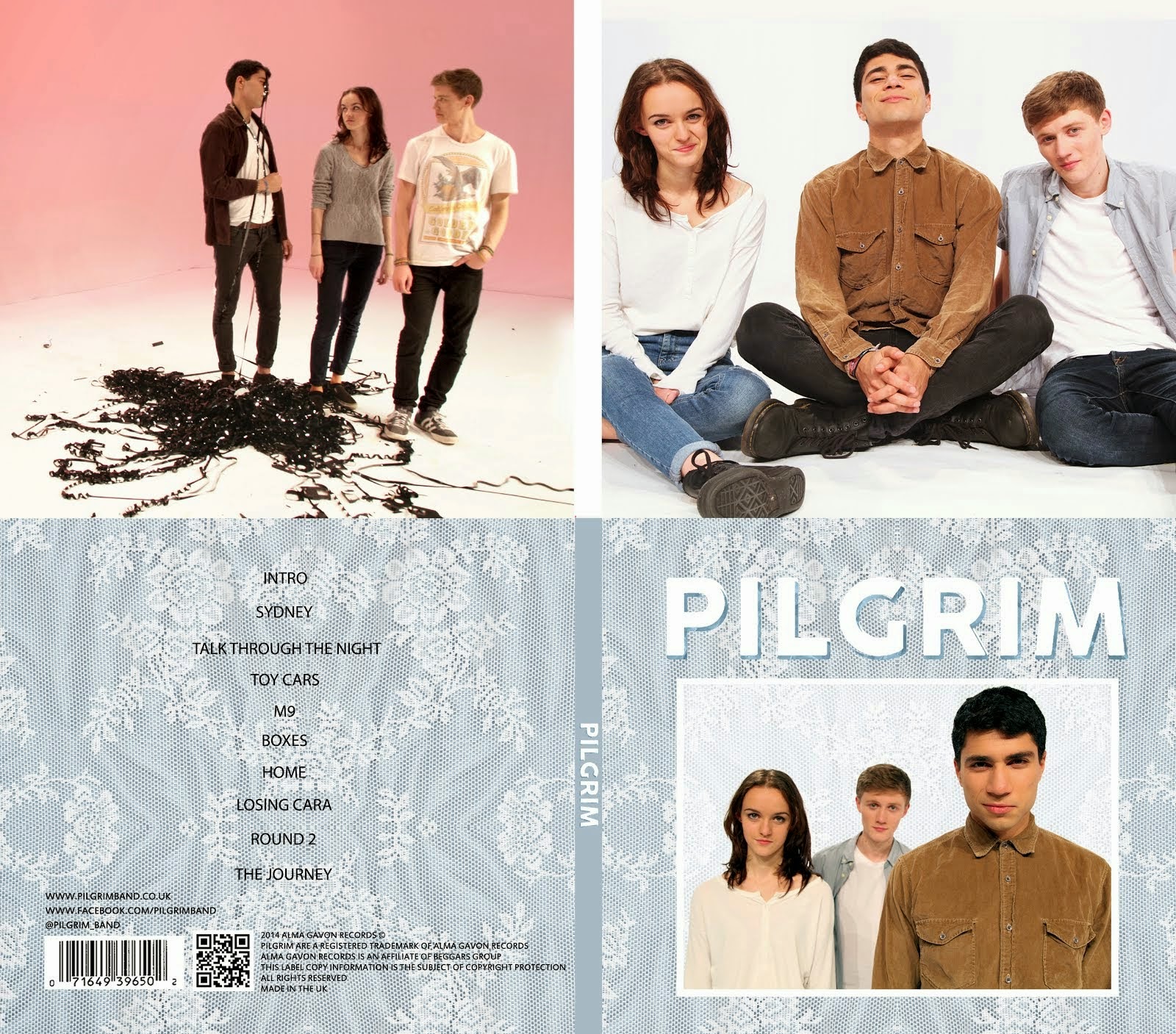
Digipack

Digipack
Our Digipack (Bottom Right, anti-clockwise: Front Cover, Back Cover, Left Inside Panel, Right Inside Panel)


Our Website (click to enter)


My name is Mahalia John (0345) and welcome to my A2 media blog.

I am part of Group 1 along with Alice Cahill (0130), Kayvon Nabijou (0610) and Gavin Fraser (0245).

You can navigate my blog using the right hand side column where you will find:

My A2 post labels including posts for the A2 Prelim, A2 research and planning and A2 Production

A live link to The Latymer School Music Video Blog

The blog archive of all my posts


Thank you for taking the time to look at my blog

Here is the live link to Group 1's Facebook Page

Tuesday, 16 September 2014

Artistic Influences of Music Videos

Having made a list of influential music videos, I decided to do some research into art, artists and artistic movements that had influenced these videos.

A playlist of my influential music videos

Surrealism

One of the biggest influences for these music videos was Surrealism. Using juxtaposition, surprise and unexplained occurrences to create a tone and mood for the video.

Famous surrealist artists include Magritte, Man Ray and Dali.

Magritte

Magritte

Magritte


The videos for George Ezra 'Blame It On Me', Paramore 'Still Into You' and Lewis Watson 'Even If' are all influenced by this.

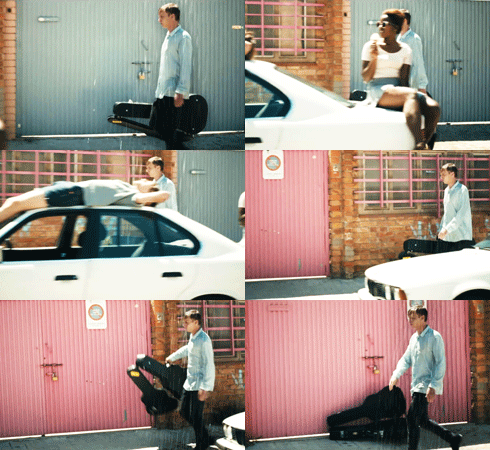
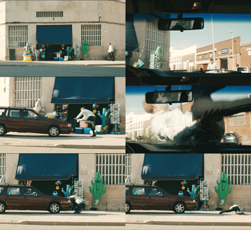
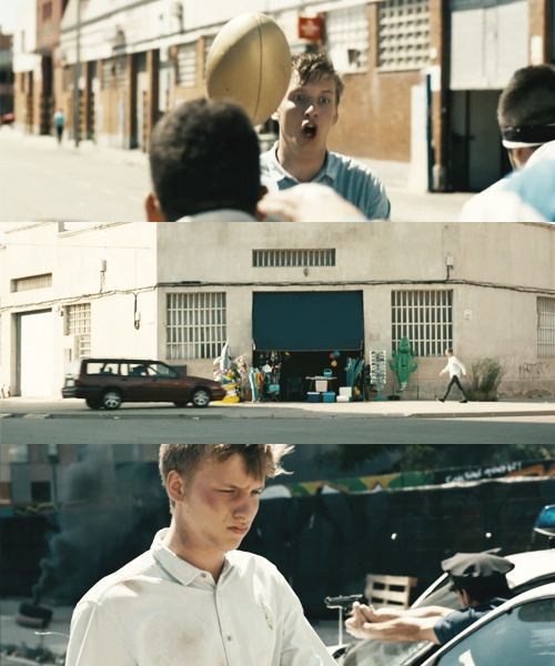
George Ezra's video is obviously surreal as he is followed by a raincloud, hit by a car and tackled by a rugby team on the street.


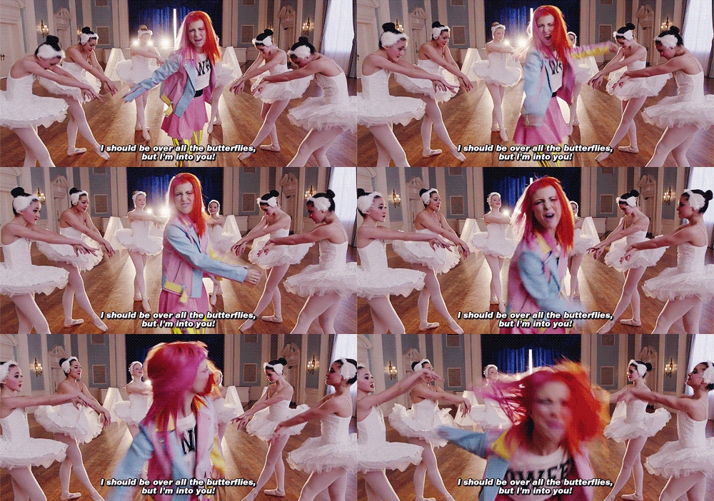
Paramore's video has elements of surrealism including Hayley Williams, the lead singer, performing surrounded by ballerinas, a bedroom full of lit birthday cakes and a room full of balloons with a boat in the middle.


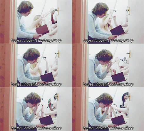
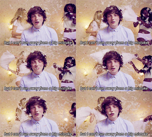
Lewis Watson's video follows the theme of the song which is about someone trying to make up for cheating on their significant other. Throughout the video Lewis Watson is surrounded by attractive girls but is ignoring them, this a surreal image.


Edward Hopper

The videos for George Ezra's 'Blame It On Me' and Sam Smith's 'I'm Not The Only One' are both influenced by the work of Edward Hopper. The use of high-key naturalistic lighting, wide framing and a solitary figure in an urban/industrial setting are what makes Hopper's works so distinctive. The figure is also often connoted as an outsider.

Hopper

Hopper

Hopper

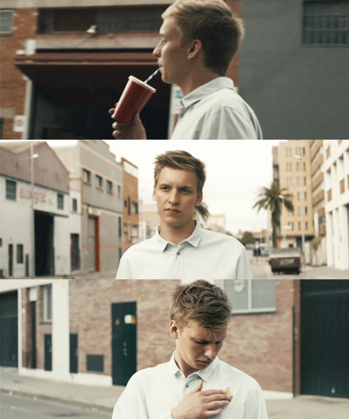
George Ezra 'Blame It On Me' - This video uses naturalistic lighting in an industrial setting and connotes George Ezra as an outsider by having events occurring around him which he has no influence on. Below are stills from the video.


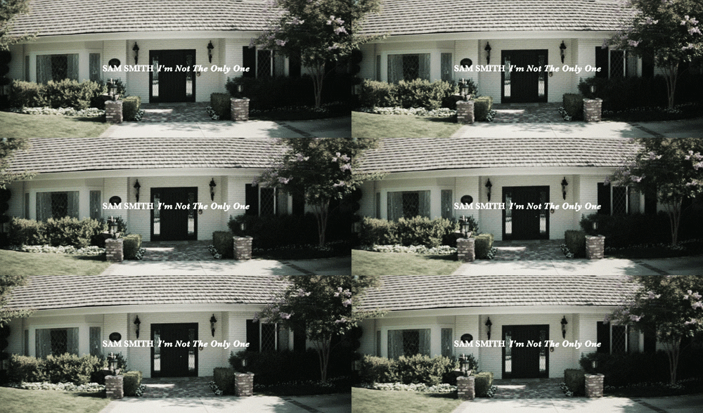
Sam Smith  'I'm Not The Only One' - The suburban setting isolates the wife character in this music video; Her isolation heightens her emotions.


Tim Walker

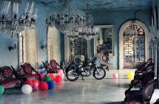
Paramore's video for 'Still Into You' is heavily influenced by the photography of Tim Walker. Below is some of Tim Walker's work compared to the 'Still Into You' video.
Tim Walker


The use of a lavish house and use of balloons and bicycles as props.


Tim Walker

A single female in a luxurious bedroom surrounded by props
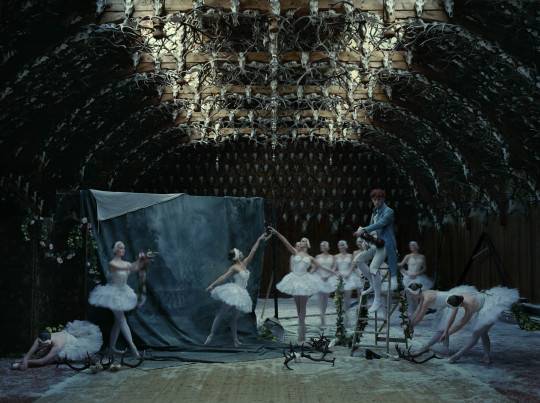
Tim Walker


Ballet dancers surrounding a solitary character.

Overall, being influenced by art can help to create a really effective music video as it provides inspiration for all aspects of the video.

Director Case Study - Mathy & Fran

Mathy & Fran are a directing and writing duo based in London who direct commercials, films and music videos. They direct indie music videos and Steve Neale states that 'genres are instances of repetition and difference which provide pleasures for audiences'. I have decided to research their music videos to see how they apply to this theory as part of my individual research.

I have chosen to study 4 of their music videos which you can see below:

Dan Croll - From Nowhere


We Were Evergreen - Best Thing


Russ Chimes - Turn Me Out


Mausi - Move On


Mathy & Fran have a very distinctive style that is consistent throughout all of their music videos.

/ Mathy & Fran favour a very naturalistic aesthetic which grounds the videos in reality.

/ Use of limited camera movement throughout but especially in wide shots makes the action in the frame more striking and gives their videos a very distinctive jaunty feel. Examples include the piƱata in the Mausi video and the banner in the Dan Croll video. They like to have the action happening in the frame and have moving subjects rather than a moving camera.

Dan Croll
Mausi

/ The use of costume is very distinctive throughout Mathy & Fran's videos. They like to use clean cut, preppy, pastel-coloured costumes with no designs or text on them. This adds to the distinctive aesthetic of their videos.

/ They like to use people as their subjects. Even their conceptual videos such as the We Were Evergreen video are based around people.

/ Mathy & Fran take influence from surrealism and this is reflected in their work. For example the 'National Staring Contest' in the Dan Croll video, the dancing in the Russ Chimes video and the actions in the We Were Evergreen video.

/ The title of the song and the name of the artist is nearly always included at the start of the video.


/ Mathy & Fran make use of slow motion lipsync which contributes to the distinctive style of their work. It is included in the Mausi and the Dan Croll videos.

/ When dance is included in their music videos it is very unique. The limited movement creates a reserved style which fits in seamlessly with Mathy & Fran's style. This kind of dancing can be seen in the We Were Evergreen and the Russ Chimes videos.

Russ Chimes

/ By being very limited with their use of camera movement Mathy & Fran are able to make the effect of it much more powerful. It is only used for specific reasons, such as in the Russ Chimes video when the camera moves with the dancers as they jump creating a powerful juxtaposition with the rest of the video.

Overall, Mathy & Fran's style is something that is key in their work. They have created an aesthetic that even without a credit would be recognisable as theirs.

Semiotic Analysis of a Music Video


'I'm Not The Only One' by Sam Smith is a song written from the perspective of a wife knowing that her husband is cheating on her. The music video follows this same narrative.

- The opening dialogue scene sets up the relationship between the husband and wife. There is tension when she says that she has made him breakfast but he says he's in a rush, this signifies his air of disrespect for her. The wife's reaction is one of not minding but her expression and intonation indicate otherwise, this suggests she knows something but is choosing to not say anything.

- The wife's costume and styling is a modern interpretation of a 50s housewife. This is connoted in her dress, her hair and make up and the image of her waving her husband off as he drives to work. The modern twist is her independence by her leaving the house and the disruption of the image of the perfect housewife when she is crying.

- The first line 'you and me we made a vow, for better or for worse' evokes the idea of marriage which increases the impact of the husband's betrayal. This is emphasised by the striking image of the wife wearing a dress not dissimilar to a wedding dress in tears with mascara running down her face.

- The wife's dress being so similar to a wedding dress also suggests that she is still committed to their marriage. In contrast, the husband's modern suit which would not be traditionally worn by a groom connotes that he has moved on and is no longer dedicated to the marriage.

- The wife burning her husband's clothes suggests that she has had enough. It is an image often associated with moving on in break ups across all media forms.

- However at the end of the video we see the wife has changed, redone her make up and hair and has cleaned up the bonfire as she happily greets her husband at the front door. This suggests that her emotional outbreaks happen often but she always covers them up and carries on, she is stuck in a vicious cycle.

Influential/Inspirational Artist Websites

Below are some of the websites which I have researched and like.

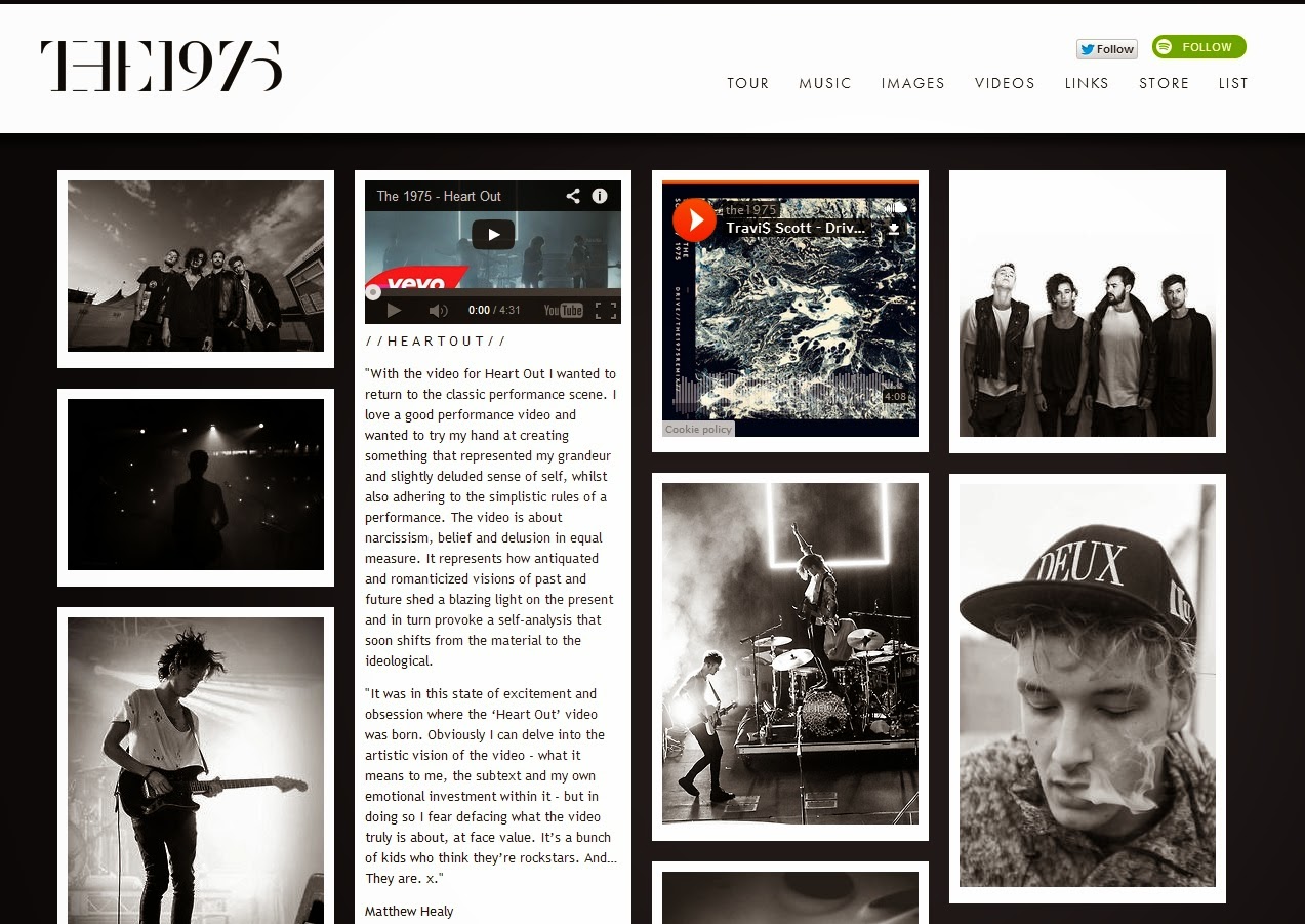
The 1975


I like the simplicity of The 1975's website. The layout is similar to blogs on sites such as Tumblr and is aesthetically pleasing. The colour scheme fits in with the band's image as a serious alternative rock band, which is something I want to consider when designing my own website.

Lewis Watson


Lewis Watson's website's main focus is on informing fans about the different versions of his debut album 'The Morning' and where to buy them. The header photo is taken directly from the album cover and the design of the rest of the website does not clash with this image. I like the nature/organic inspired artwork and design.

 Dan Croll

I like the simple layout and easy navigation of Dan Croll's website, things which are very important if people are to engage with your website.

George Ezra


I love the originality of George Ezra's website and the navigation of it. Scrolling through moves not only the content but also changes the background. It is fun as well as being easy to navigate.

During my research I have found that artist's websites clearly fit in with the artist's marketed image to create synergistic content. Usually the design is based around the artist's most recent album or EP which is then advertised somewhere prominent on the website, this makes the website flow and leads consumers to buy the music. Social media links are also an important aspect, they are usually listed together somewhere prominent on every page so consumers can interact with the band via social media. These are all things which I want to us on my own website.

Influential/Inspirational Album Covers

Below are some album covers that I really like and will definitely influence my own album cover.

Dan Croll - Sweet Disarray
I like the use of colour and texture surrounding the striking focal image. The text fits in really well with the whole design.

Anavae - Into The Aether
I like the use of smoke and backlighting in this video, it clearly defines the Rock genre.

Arctic Monkeys - AM

Beyonce - Beyonce
The simple designs of AM and Beyonce are extremely effective and are iconic designs for iconic artsists.

Green Day - Dookie
I like the postmodern design of this album cover for punk rock band Green Day. The cartoon artwork works really well and gives it a comical feel.
Hudson Taylor - Battles
I love the grainy look of this cover, similar to old film photographs. The colour scheme works really well and the text stands out but fits in with the cover.
Lewis Watson - Four More Songs
I love the use of colour and the collage/scrapbook style of Lewis Watson's EP cover.

The Neighbourhood - I Love You

Pegasus Bridge - While We're Young

5 Seconds of Summer - (Self Titled)
This is different from my other influences but I like the focal image because it shows the band's personality. The spray paint effect is really good too.

The 1975 - (Self Titled)
I like simple and striking album covers that clearly represent their genre. Album covers that don't feature the artist tend to be very striking and clearly thought out. I hope to take all of this into account regarding my own album cover.

The kind of music video I want to make


One of my ideas is for the song 'Always Like This' by Indie/Acoustic artist Dan Croll. He describes it as a 'summer song' and listening to it evokes feelings of summer, well being, nostalgia and laughter.

I imagine a three piece band to be playing in a studio in front of a pastel lit background, starting with the lead singer playing by himself and introducing the other band members as the video goes along. As well as performance we would see the band laughing, messing about with props and being playful to go along with the mood of the song. The other members of the band will lip sync as well as the main vocalist, especially on the 'ello ello ello' line.

 
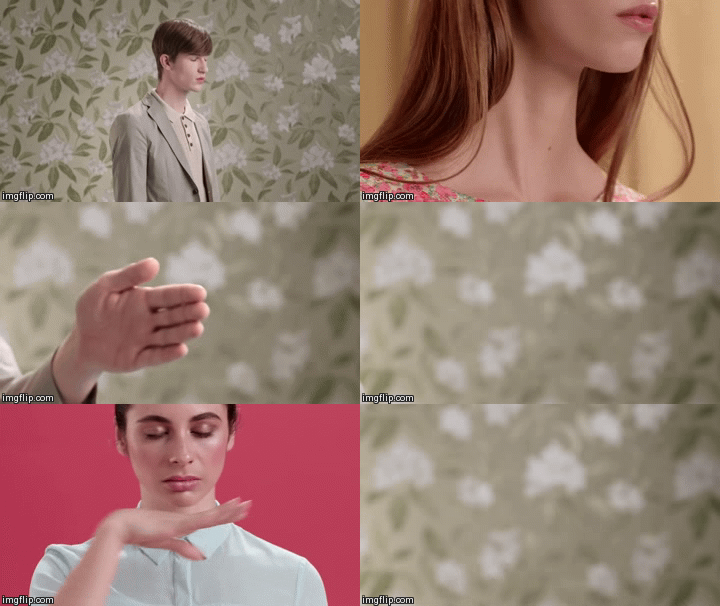
Gifs from George Ezra's alternative music video for 'Budapest' which has a similar look and feel to my idea.

 
These gifs are from Paramore's music video for 'Still Into You', I like the way the band are messing around with props, the playfulness of it and the colours.

This is a video of the artist Dan Croll talking about how he wrote the track and what inspired it: