Our Music Video


Our Music Video

Digipack

Digipack
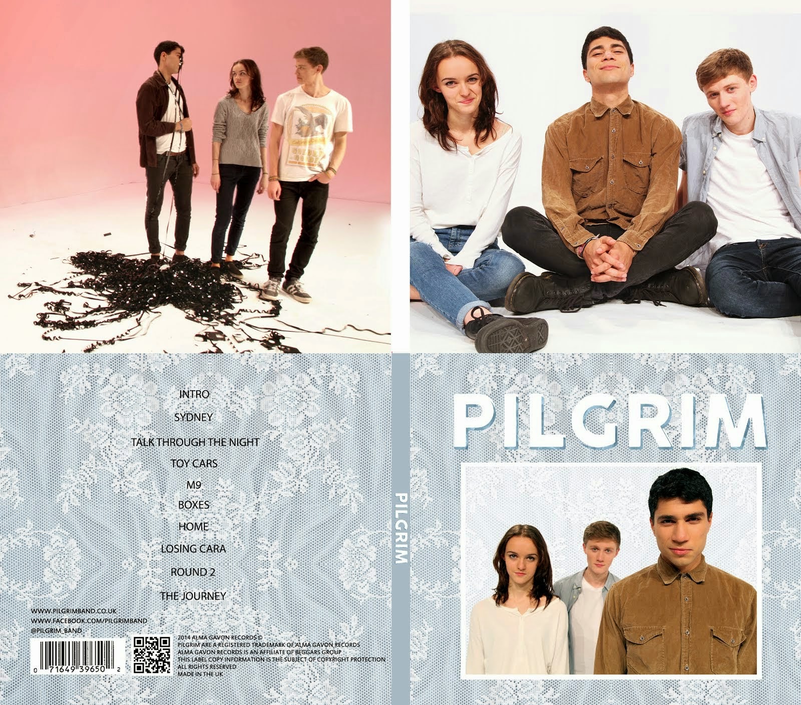
Our Digipack (Bottom Right, anti-clockwise: Front Cover, Back Cover, Left Inside Panel, Right Inside Panel)


Our Website (click to enter)


My name is Mahalia John (0345) and welcome to my A2 media blog.

I am part of Group 1 along with Alice Cahill (0130), Kayvon Nabijou (0610) and Gavin Fraser (0245).

You can navigate my blog using the right hand side column where you will find:

My A2 post labels including posts for the A2 Prelim, A2 research and planning and A2 Production

A live link to The Latymer School Music Video Blog

The blog archive of all my posts


Thank you for taking the time to look at my blog

Here is the live link to Group 1's Facebook Page
Showing posts with label DYM Hw. Show all posts

Tuesday, 16 September 2014

Semiotic Analysis of a Music Video


'I'm Not The Only One' by Sam Smith is a song written from the perspective of a wife knowing that her husband is cheating on her. The music video follows this same narrative.

- The opening dialogue scene sets up the relationship between the husband and wife. There is tension when she says that she has made him breakfast but he says he's in a rush, this signifies his air of disrespect for her. The wife's reaction is one of not minding but her expression and intonation indicate otherwise, this suggests she knows something but is choosing to not say anything.

- The wife's costume and styling is a modern interpretation of a 50s housewife. This is connoted in her dress, her hair and make up and the image of her waving her husband off as he drives to work. The modern twist is her independence by her leaving the house and the disruption of the image of the perfect housewife when she is crying.

- The first line 'you and me we made a vow, for better or for worse' evokes the idea of marriage which increases the impact of the husband's betrayal. This is emphasised by the striking image of the wife wearing a dress not dissimilar to a wedding dress in tears with mascara running down her face.

- The wife's dress being so similar to a wedding dress also suggests that she is still committed to their marriage. In contrast, the husband's modern suit which would not be traditionally worn by a groom connotes that he has moved on and is no longer dedicated to the marriage.

- The wife burning her husband's clothes suggests that she has had enough. It is an image often associated with moving on in break ups across all media forms.

- However at the end of the video we see the wife has changed, redone her make up and hair and has cleaned up the bonfire as she happily greets her husband at the front door. This suggests that her emotional outbreaks happen often but she always covers them up and carries on, she is stuck in a vicious cycle.

Monday, 14 October 2013

Dexter Edit


Summarise the conventions of title sequences that were most important to this task
The purpose of a title sequence is to inform the audience who made the TV show/film and who is in it. There are many conventions of title sequences but some we had to consider more than others.

Font - The font is key as it has to match the themes and aesthetics of the film/TV show.


Colour - The colour of the titles cannot clash with the images in the sequence but it also has to stand out so choosing a colour is difficult.

Movement - The titles can be static but they can also move and interact with the moving images. For example in Zombieland where the actions of the characters affects the text.

2. How did your group plan to edit the title sequence? (consider timings, industry requirements etc).

We had very limited time to edit in so we set ourselves a realistic goal of 5 titles. There were three of us in the group and we took it in turns to create a title each. Before creating the titles we wrote out a list of where we wanted to place our titles in the sequence, we chose our favourite five and made those.

3. Explain the creative decisions made by your group.

 Font - We had to choose a font that reflected and matched the show. Dexter is about a serial killer who seems like a normal american civilian. Therefore we chose a sophisticated times new roman-esque font because it reflected the normal side of Dexter's character but the sleekness of it suggested something more sinister.

Colour - The title sequence was colourful so we decided to make our text white. This complemented the colours of the images and reflected Dexter's innocent appearance as a character.

4. How does your re-edit compare to the original?

The original is better as the creators of it were familiar with the show and had a lot more time to consider their creative decisions. Also the amount of time meant that they were able to create 23 titles compared to our 5. Having 23 titles meant there were no huge gaps without text which was a problem in our sequence. Their font was also a lot more masculine than ours which matched the show however I think our font and the original font both worked, even if it was for different reasons.

Wednesday, 2 October 2013

AoT Grid Analysis


Summarise your film idea

Our film 'immolere' is a horror about a serial killer who is cast out by a group of friends and sets out to murder each one of them finishing with the ring leader. Our film opening starts with the investigation of the murder of one of the group.


What kind of information has been included in your film opening?

Characters - The Antagonist (the killer), the group of friends and our protagonist (the ring leader) have all been introduced through images of them.

Genre - Horror is connoted through the low key lighting, knives, disturbing imagery (girls with crosses over their faces) and the images of a corpse.

Concept - The murder of a group of girls is suggested because the first image is of a group of girls and there are shots of corpses and knives.

Cast and Crew

Title - 'immolere'


How do the titles link to the main film idea?

- The shot of knives laid out in a row links to the serial killer in our film.

- Our characters are shown in photos with their faces crossed out.

- The corpse is one of the killer's victims.

- Our title 'immolere' is a latin word meaning to kill by ritual sacrifice.


Summarise the expected audience reaction

We intend to scare or unsettle our audience because our genre is horror. We have given our audience some information such as the concept but have created many enigmas which make them want to keep watching. We created enigmas through Low Key Lighting and not showing the antagonists face. Our opening is incredibly ambiguous and by the end of it the audience should be hooked by the story and want to keep watching.

Identify 3 things in your grid that are important in an opening sequence

1. Titles

2. Introduction to character

3. concept and genre


How effective is your project as a film opening?

- I think our project is effective as it quickly connotes the genre and applies the conventions of a film opening title sequence.

- In hindsight I probably would have shot in more detailed locations so we could have had establishing shots.

Thursday, 19 September 2013


This is the opening sequence for Drive (2011).

Drive is a thriller about a getaway driver who lands himself in trouble when he decides to help out a neighbour.

Almost instantly the film reveals its setting of LA, through the character's dialogue and the map of the city. The low key lighting and the character talking about a robbery establish the film as a thriller.

In the first scene the protagonist 'Driver' is introduced, his dialogue is calm and to the point, even though he is in a dangerous situation, this is a reflection of his character. The character 'Driver' is extremely enigmatic, he has fewer lines than most protagonists and his face is usually void of emotion. A key example of this is in the getaway; he remains extremely calm in a highly tense situation and he is well practiced at getaway driving which raises lots of enigmas such as 'How did he get into getaway driving?' and 'Why is he so good at it?'. The mis-en-scene of his apartment adds to this image of him as it contains very few possessions.

The getaway scene is a great example of executing set pieces smarter. In a big hollywood blockbuster the getaway would be a high speed chase across the desert ending in an explosion. The director Nicolas Winding-Refn uses his smaller budget ($13 million) very cleverly. The music is pulsating and almost mimics a heartbeat which heightens the tension along with the contrasting composures of the characters: Driver is calm and confident but the robbers in the passenger seats are tense and jumpy. The whole scene has low key lighting which is a convention of thriller films. The editing in this scene is all straight cuts but it is not fast paced which reflects Driver's calmness. The scene uses lighting, music and character to create tension.

The story starts by introducing the protagonist and straightaway it is revealed that he is a getaway driver because of his phone conversation and him going to collect the car. At the end of the getaway Driver escapes by disguising himself as a baseball fan this suggests he is clever. The credits are shown over shots of Driver driving around LA at night.