Our Music Video
Our Music Video
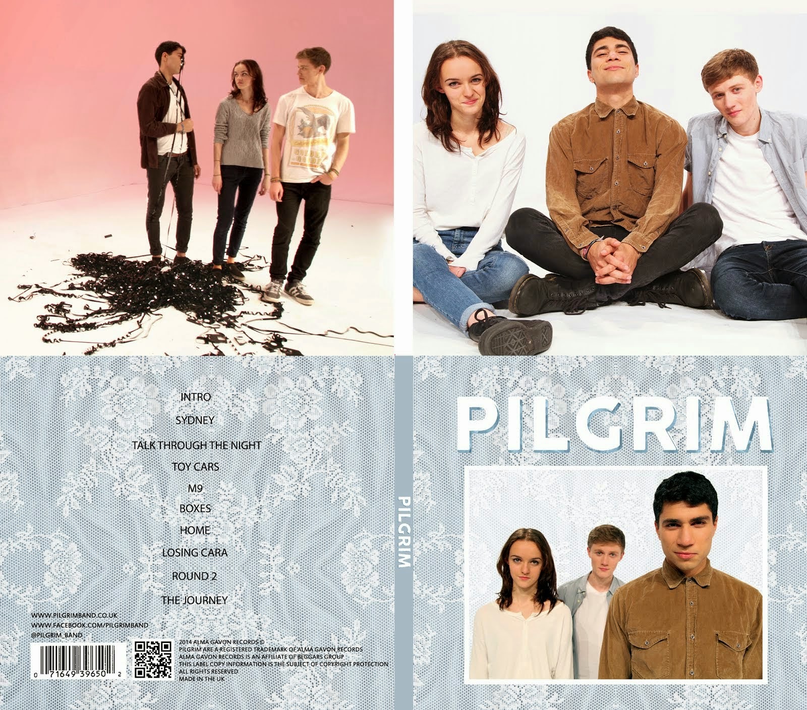
Digipack

Our Digipack (Bottom Right, anti-clockwise: Front Cover, Back Cover, Left Inside Panel, Right Inside Panel)
I am part of Group 1 along with Alice Cahill (0130), Kayvon Nabijou (0610) and Gavin Fraser (0245).
You can navigate my blog using the right hand side column where you will find:
My A2 post labels including posts for the A2 Prelim, A2 research and planning and A2 Production
A live link to The Latymer School Music Video Blog
The blog archive of all my posts
Thank you for taking the time to look at my blog
Here is the live link to Group 1's Facebook Page
Monday, 14 October 2013
Dexter Edit
Summarise the conventions of title sequences that were most important to this task
The purpose of a title sequence is to inform the audience who made the TV show/film and who is in it. There are many conventions of title sequences but some we had to consider more than others.
Font - The font is key as it has to match the themes and aesthetics of the film/TV show.
Colour - The colour of the titles cannot clash with the images in the sequence but it also has to stand out so choosing a colour is difficult.
Movement - The titles can be static but they can also move and interact with the moving images. For example in Zombieland where the actions of the characters affects the text.
2. How did your group plan to edit the title sequence? (consider timings, industry requirements etc).
We had very limited time to edit in so we set ourselves a realistic goal of 5 titles. There were three of us in the group and we took it in turns to create a title each. Before creating the titles we wrote out a list of where we wanted to place our titles in the sequence, we chose our favourite five and made those.
3. Explain the creative decisions made by your group.
Font - We had to choose a font that reflected and matched the show. Dexter is about a serial killer who seems like a normal american civilian. Therefore we chose a sophisticated times new roman-esque font because it reflected the normal side of Dexter's character but the sleekness of it suggested something more sinister.
Colour - The title sequence was colourful so we decided to make our text white. This complemented the colours of the images and reflected Dexter's innocent appearance as a character.
4. How does your re-edit compare to the original?
The original is better as the creators of it were familiar with the show and had a lot more time to consider their creative decisions. Also the amount of time meant that they were able to create 23 titles compared to our 5. Having 23 titles meant there were no huge gaps without text which was a problem in our sequence. Their font was also a lot more masculine than ours which matched the show however I think our font and the original font both worked, even if it was for different reasons.
Subscribe to:
Post Comments (Atom)


Well done Mahalia. Your homework posts have all been presented to a very high standard and you have shown excellent theoretical understanding in each task. You also use technical terminology with accuracy. You are making very good progress, so please maintain this high standard.
ReplyDelete