Because so far we have a final design for our album cover we can now move on to design the other three panels of our digipack.
 |
| Our Album Cover so far |
Back Cover
First of all, we decided to go back to our research of album back covers in the
album influences post. We also looked at some other albums to see what we liked and what the conventions of our genre were.
The main conventions for indie albums we noticed were:
- Minimalist and simple design with sans serif font
- Strong visual similarities between front and back cover
- Institutional information such as record company logo, artist website, barcode and copyright notices
Below are some of the album covers that we looked at
Dan Croll - Sweet Disarray
The 1975 (Self-Titled)
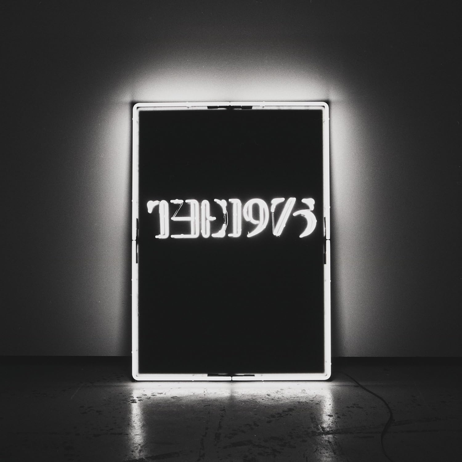
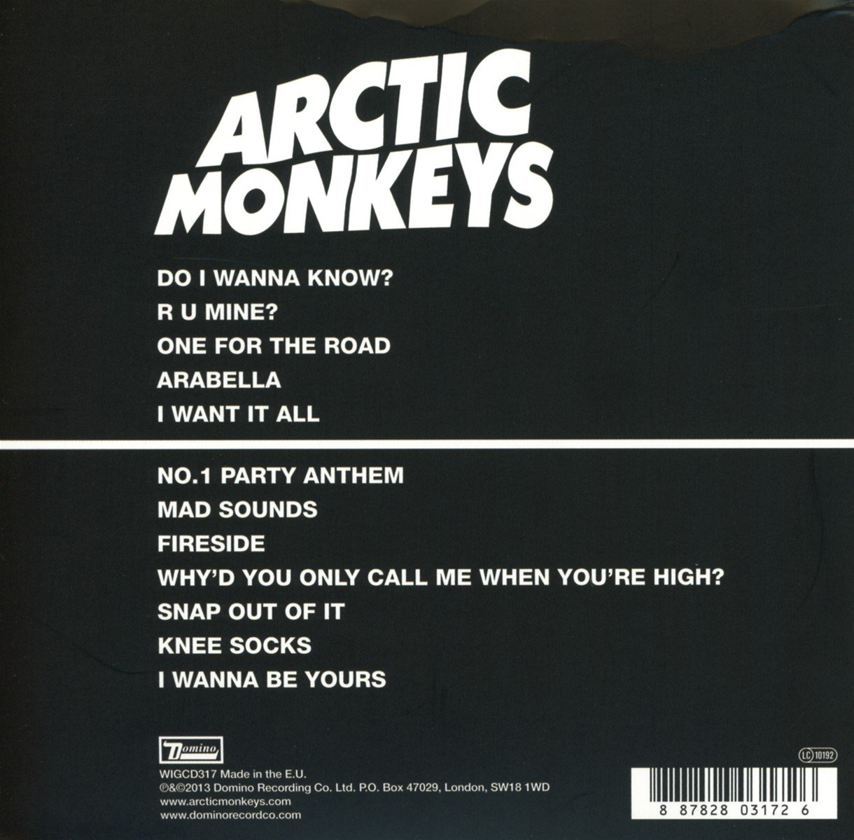
Arctic Monkeys - AM
We decided to follow the conventions of indie album covers as we liked the way they looked and felt they would work well for our own. Alice created a rough design using the texture from the front cover, 10 tracks, a barcode and the positioning of the institutional logos and information. The whole group like the simplicity of it and the way it visually flowed and worked with with the front cover.
 |
| Alice's rough design |
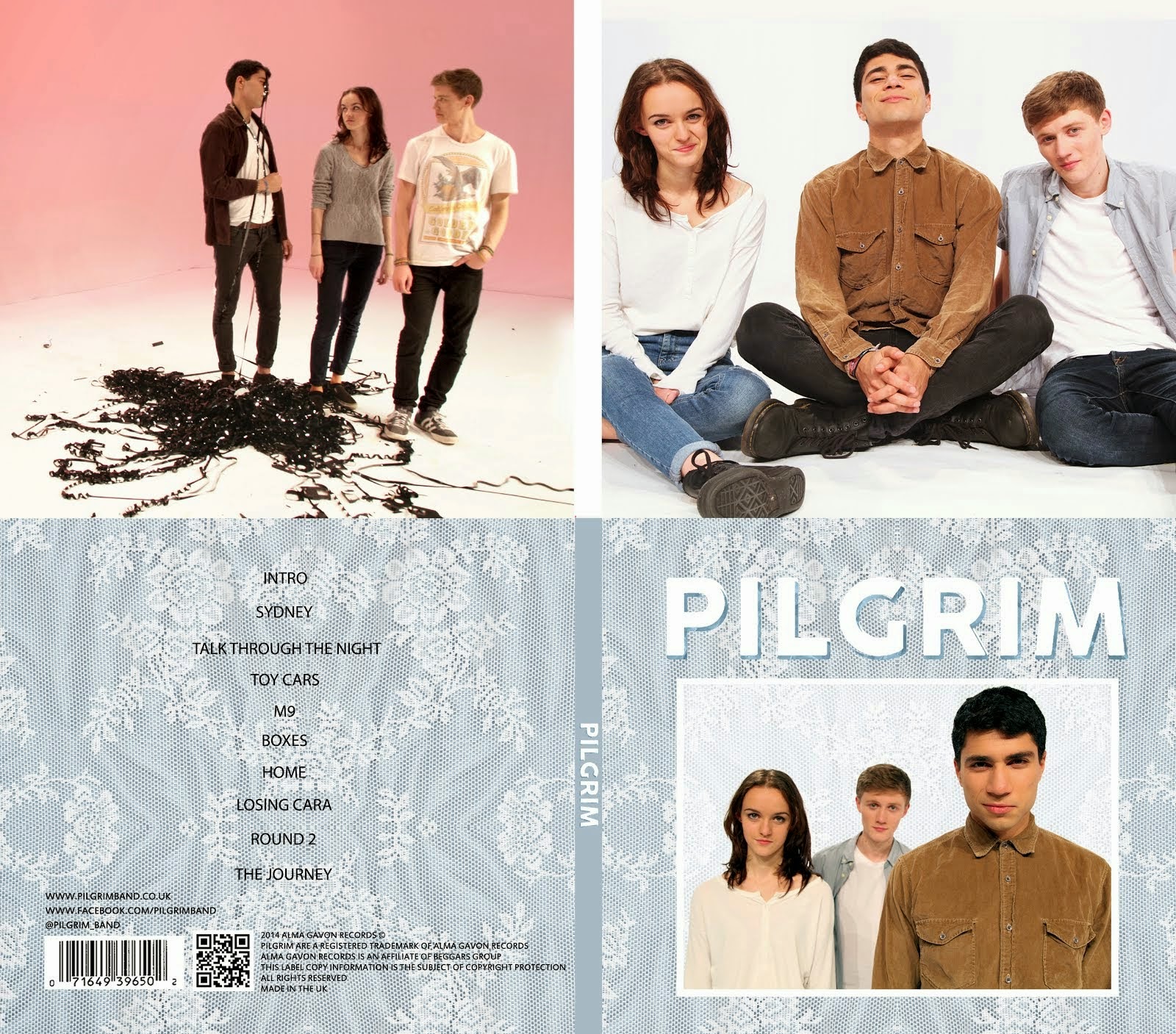
Inside Panels
Having looked at albums of all genres we found that it was conventional to have a photo of the band or artwork visually similar to the album. Examples of indie albums using this are below:
Arctic Monkeys - AM
 |
| Right Panel |
The 1975 (Self-Titled)
 |
| Left and Right Panels |
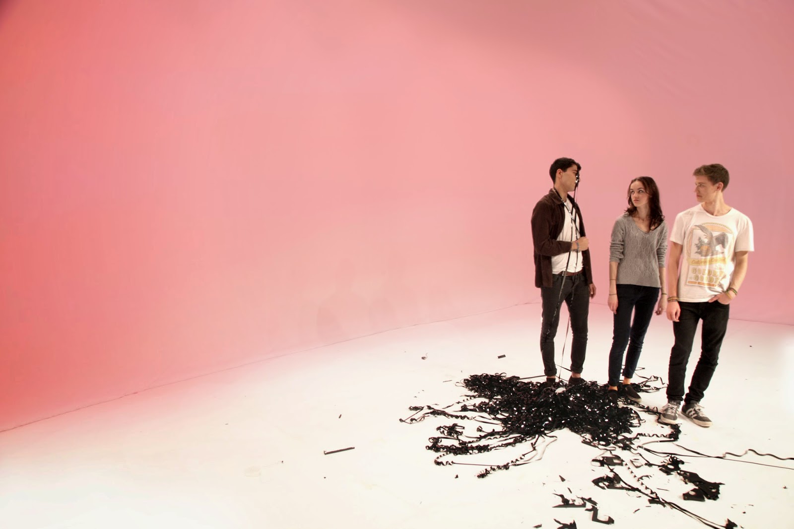
We looked through all of the photos that we had taken in the studio and I suggested that we use this photos from the music video shoot. We liked it because it connoted the band's playful image, which doesn't come across as much on the front and back covers, and because the pale pink colour didn't clash with the pale blue of the front and back panels.
 |
| The photo we chose |
Once we had found this photo I began to edit it by removing the dark line between the cyclorama and the floor. However, because we were sharing out roles Alice finished editing the photo. She made the entire background pink, cleaned up the floor and made the band brighter.
 |
| The edited image |
Once we were happy with the edited image Alice placed it onto the digipack template and, using facebook, we held a group feedback session.
 |
| The group feedback session |
The next day, after a group feedback session in person, the group decided that we liked the smaller version better because it was more subtle while still being clear what was in the photograph.
 |
| Larger version |
 |
| Smaller version |
We will continue to make adjustments until we are entirely happy with our digipack.


.jpg)