We liked the landing page, colour scheme and textured background of the Dog Is Dead website
 |
| Dog Is Dead's Landing Page |
We liked the strong colour scheme, strong layout and how simple Dan Croll's website was.
 |
| Dan Croll's website |
We liked the Home Page of The 1975's Website as it laid out the images, videos and news from the band in a way that we really liked. We also liked the way that, on their links page, they had customised social media icons to fit with the aesthetic of the website and the band.
|
 |
| The 1975's Home Page |
 |
| The 1975's Links Page |
Alice recently found the Rizzle Kicks website which we all really liked as it used the Tumblr Blog style that we wanted to go for.
 |
| Rizzle Kick's Website |
Having done this research, Alice drew up a flat plan of what our website was roughly going to look like. We tried to clearly connote genre and include conventions of an indie band's website such as social media icons and the band logo. We decided which pages we were going to have by looking at our influential websites, they are shown in the menu bar below the Pilgrim logo. However, we decided not to include the music page as Pilgrim is a debut band so does not have a substantial discography.
Because a large majority of our audience use social media we wanted to make our Homepage a hub for all news and social media updates about Pilgrim, for our audience to interact with. We will have our music video to watch, social media updates from Instagram, Twitter and Facebook, music to listen to on Spotify and Soundcloud and music to buy from iTunes and Amazon. This should provide the audience with an interactive, non-linear and immersive experience.
Below is a video that Gavin made of himself navigating a rough version of our website.
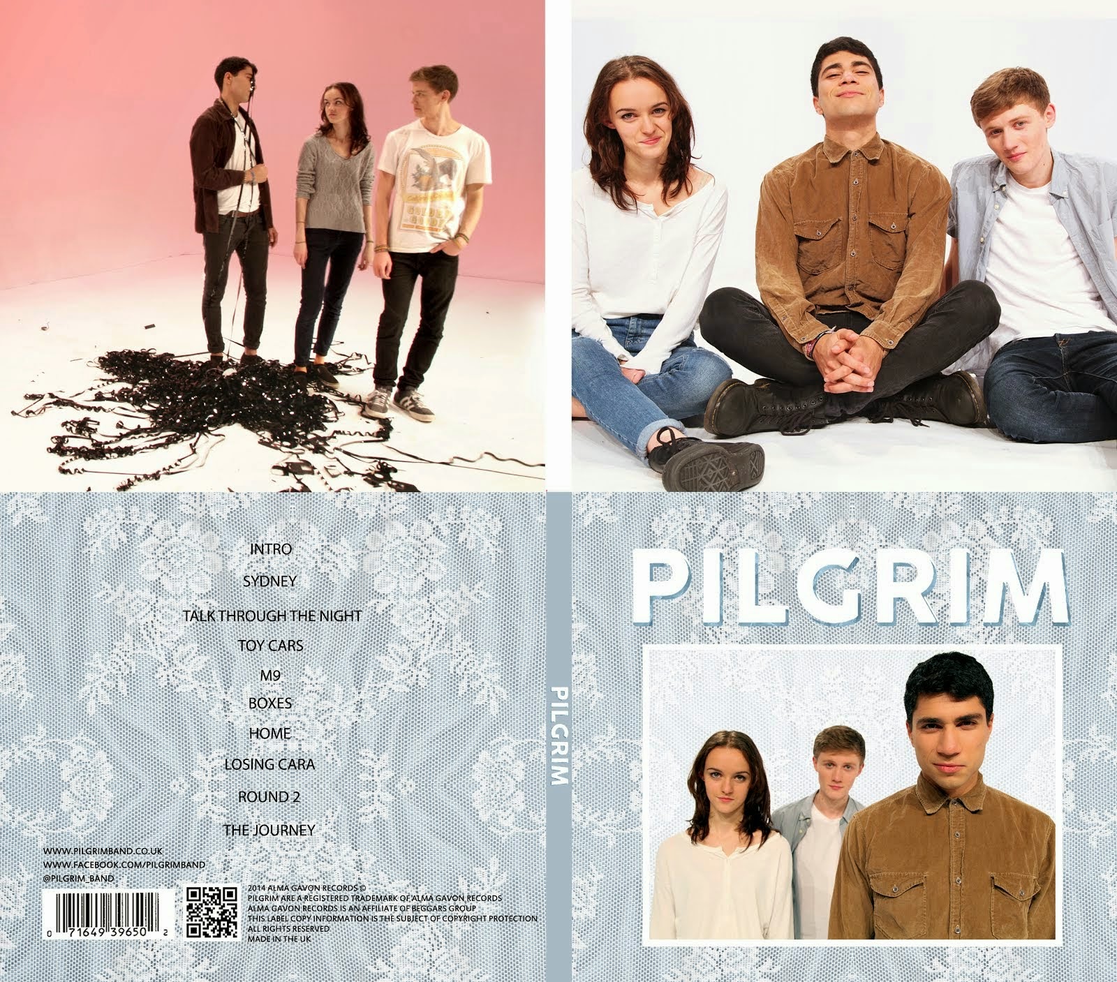
It shows the rough layout that we want to go for and how the website will link to social media and incorporate videos and images. The finished website will have a similar aesthetic to Pilgrim's album cover to create a synergistic brand for our artist.


No comments:
Post a Comment