Our Music Video


Our Music Video

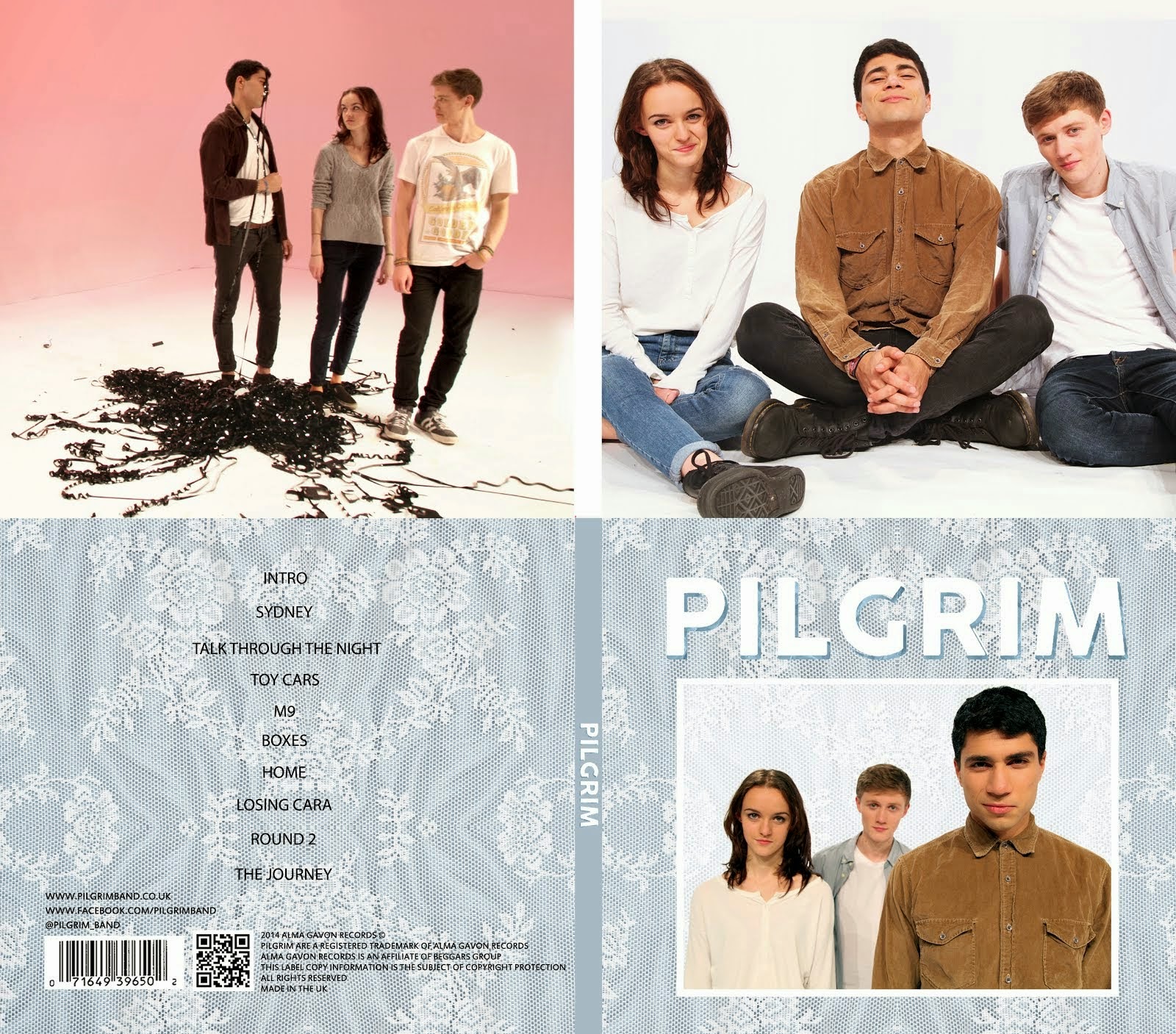
Digipack

Digipack
Our Digipack (Bottom Right, anti-clockwise: Front Cover, Back Cover, Left Inside Panel, Right Inside Panel)


Our Website (click to enter)


My name is Mahalia John (0345) and welcome to my A2 media blog.

I am part of Group 1 along with Alice Cahill (0130), Kayvon Nabijou (0610) and Gavin Fraser (0245).

You can navigate my blog using the right hand side column where you will find:

My A2 post labels including posts for the A2 Prelim, A2 research and planning and A2 Production

A live link to The Latymer School Music Video Blog

The blog archive of all my posts


Thank you for taking the time to look at my blog

Here is the live link to Group 1's Facebook Page

Friday, 19 December 2014

Branding Improvements

During feedback it was pointed out that our blue lace texture is our main visual on our album cover and website. We felt that this was an issue as it was a found image and not one that we had created ourselves.

Our blue lace texture
We also realised that, when selecting the texture, we had not given enough thought to it's connotations and what that reflected on our band. As a result we had a group meeting and conducted audience feedback sessions. We concluded that:

- The lace texture is very vintage looking, which suits Pilgrim's image as a cool, quirky, indie band .
- It reminded us and our audience of textures you would find at home on curtains, pillows and blankets and evoked feelings of home and welcoming; this worked well with Pilgrim's friendly, approachable image.
- The lace is slightly feminine juxtaposing conventional indie albums which are usually quite masculine. It also reflects Ash, our female bassist, as part of the band.

Our Album Cover
Our Website

Having concluded this, we decided that we wanted to create our own texture. At home, I scanned in a lace curtain with various fabrics laid on top of it. Below are our favourite three:


As a group we chose the blue texture and edited it in photoshop by brightening it and turning the saturation up. We then added it to our album cover and website.

The texture on our album cover

The texture on our website

I am very happy with how the texture turned out and think it actually works better than our previous texture as it is brighter.

No comments:

Post a Comment