Below are some of the websites which I have researched and like.
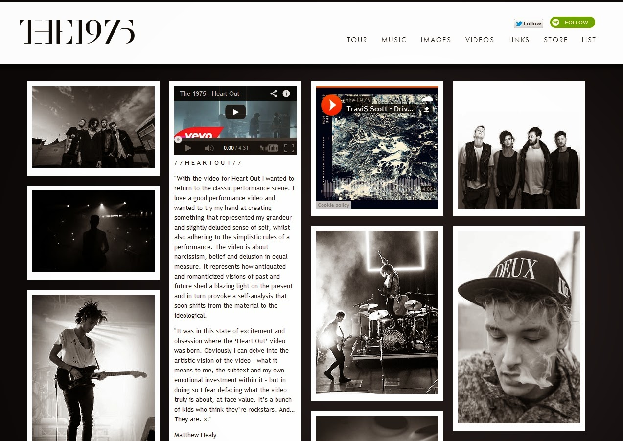
The 1975
I like the simplicity of The 1975's website. The layout is similar to blogs on sites such as Tumblr and is aesthetically pleasing. The colour scheme fits in with the band's image as a serious alternative rock band, which is something I want to consider when designing my own website.
Lewis Watson's website's main focus is on informing fans about the different versions of his debut album 'The Morning' and where to buy them. The header photo is taken directly from the album cover and the design of the rest of the website does not clash with this image. I like the nature/organic inspired artwork and design.
I like the simple layout and easy navigation of Dan Croll's website, things which are very important if people are to engage with your website.
George Ezra
I love the originality of George Ezra's website and the navigation of it. Scrolling through moves not only the content but also changes the background. It is fun as well as being easy to navigate.


No comments:
Post a Comment