Having drawn up some basic flat plans, we decided to start working in Photoshop straight away as we felt it was an easier way to convey our ideas.
 |
| Our initial flat plans |
Alice had the idea of incorporating textures into the album design so we searched for textures that we liked. Some of them are below.
We decided to use the publicity shots from our research in the mock-ups. At first we just experimented with textures not text. Below are the designs Alice made using the Daughter publicity shot. The first two designs are my favourite as I like the way the texture is incorporated into the photo. I like the texture of the last one.
Liking the idea of textures, we experimented with a completely new one that felt very different to our initial ones, the results are below. I feel the first two work the best as the texture is very striking and works well with the overall design. I think that the photo in the last one is too wide to work as well with the texture. We liked these designs but decided not to go forward with them as they were more suited to the pop-punk and punk-rock genre rather than indie.
Alongside the designs that Alice made Gavin also did his own designs. He used a different publicity shot and font, experimenting with a different layout and textures.
Kayvon also created some initial designs using a different publicity shot of Metronomy. I love the cut-out effect of the text and the way the colour matches the band's jackets.
Having three lots of designs, we were then able to move on to create more designs that the whole group were happy with. Alice created more designs using publicity shots with white backgrounds as we plan to have this in our own shots.
 |
| 1 |
 |
| 2 |
 |
| 3 |
 |
| 4 |
 |
| 5 |
 |
| 6 |
 |
| 7 |
 |
| 8 |
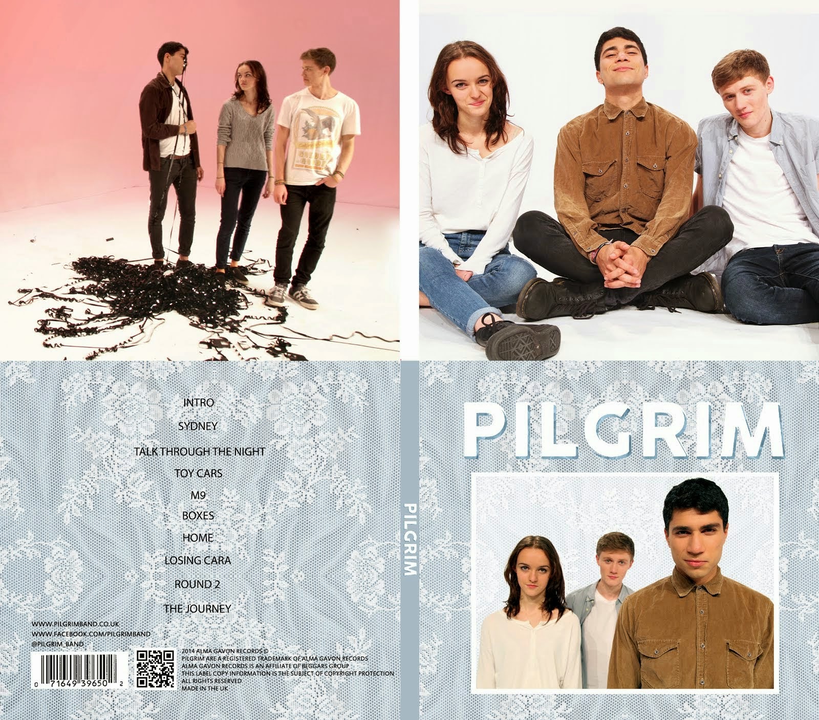
Designs 1, 2, 6 and 7 are my favourite as I like the simplicity of them and the way they fit well with Pilgrim's image. The effect of the light behind the text in no. 7 is particularly visually striking. When we were reviewing these designs as a group Gavin realised that the logo was very similar to that of the band Muse. We decided to changed our logo design.
 |
| Muse's Logo |
Following this group feedback session Alice, Gavin and I designed a new cover with a new logo. We used the Clean Bandit publicity shot because we felt that it had the same playfulness as Pilgrim. When designing we used two paper textures, added contrast to the image and used a clipping mask on the text.
We liked this design but we felt that it was a bit 2D so Gavin and Alice worked on the design and made changes to it. They added a black shadow to the text which did make it more 3D but we felt that it didn't fit with the aesthetic of the rest of the cover. To fix this a clipping mask was used on the drop shadow so the background texture came through, we all liked this effect.


No comments:
Post a Comment