Before designing our album cover, we decided to do some research into different album covers that we liked and find elements that we wanted to incorporate into our own design. I have annotated what we liked about each influence.
Front Cover:
 |
| We liked the strong focal image and how the texture was incorporated into it. The text is especially effective, with a line separating the two titles. |
 |
| The use of block colour and the white border around the edge. The solid colour makes it geometric and we liked the focal image breaching the white border as it is aesthetically pleasing. |
 |
| We liked the use of a banner across the top as well as the square border and the line separating the text. The natural lighting in the photograph is a similar look to what we would like. |
 |
| The use of frame within a frame as well as blocked colours. We liked how clearly it is connoted as an indie album with the use of a polaroid, the designs and instruments. |
 |
| The texture and use of colour to create an interesting silhouetted image and the placement of simple, white font in the middle |
 |
| The use of images within text is really interesting |
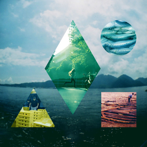 |
| Playing around with perceptions by fitting images in with other ones. Geometric shapes and the use of colour. |
 |
| Striking text with a clear colour scheme. |
Back Cover:
 |
| Distinctive and unique layout of text. Institutional logos down the side. |
 |
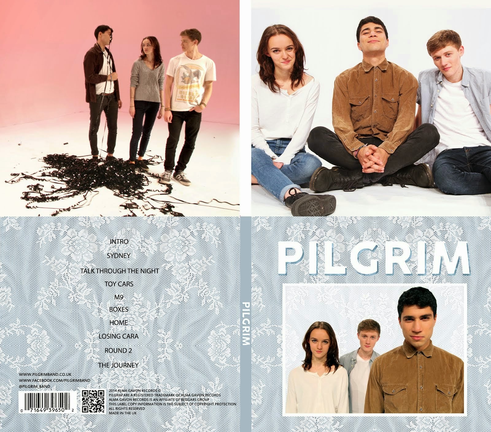
| Reflective of the front cover. Track listing down the side. |
 |
| Minimalist layout. Synergistic with band's image. Black and white colour scheme. |
Font:
While thinking about the font we looked at some music videos in which we had liked the use of it.
George Ezra -
Blame It On Me
 |
| We liked the sans serif font and the line separating the words |
Jacksgap -
Shed Sessions
 |
| We liked the white sans serif font, the arrangement and the use of a box. |
From our research we have a list of features that we would like to include in our own album cover:
- Sans Serif font
- Lines, frames and borders
- Geometric shapes
- Photo of the band
- Defined and simple colour scheme


No comments:
Post a Comment