

 |
| Album cover options |
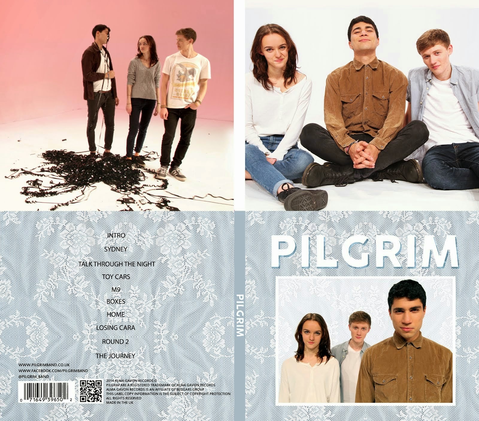
Alice and I decided to create a design that fit with our intended colour scheme of blue, white and grey. We decided to use the photo below because we felt it connoted the band's playful image.

Below are the two designs that we created as options for our final album cover. The brown one was based on our initial design and the blue one was the new one that Alice and I designed.


Following an audience feedback session of indie music fans (our target audience) we found that
- Most people preferred the blue design.
- The photo didn't make Pilgrim look like a real band.
- The white text was difficult to read.
Taking this feedback into account we created a new design which you can see below. We changed the photograph, added a blue drop shadow and moved the text above the image as we felt that it looked a bit like a calendar when it was below.

We asked the same group of people again; they said that they liked it more than the last one but that the drop shadow looked unprofessional. To resolve this we decided to use something more subtle by adding a texture to the drop shadow.
In Photoshop we added a clipping mask over the drop shadow. Below are the two textures that we liked the most.
 |
| Our different texture layers in photoshop |
 |
| The first texture |
 |
| The second texture |
Having decided on the first texture, we adjusted our design:

No comments:
Post a Comment