Our Music Video


Our Music Video

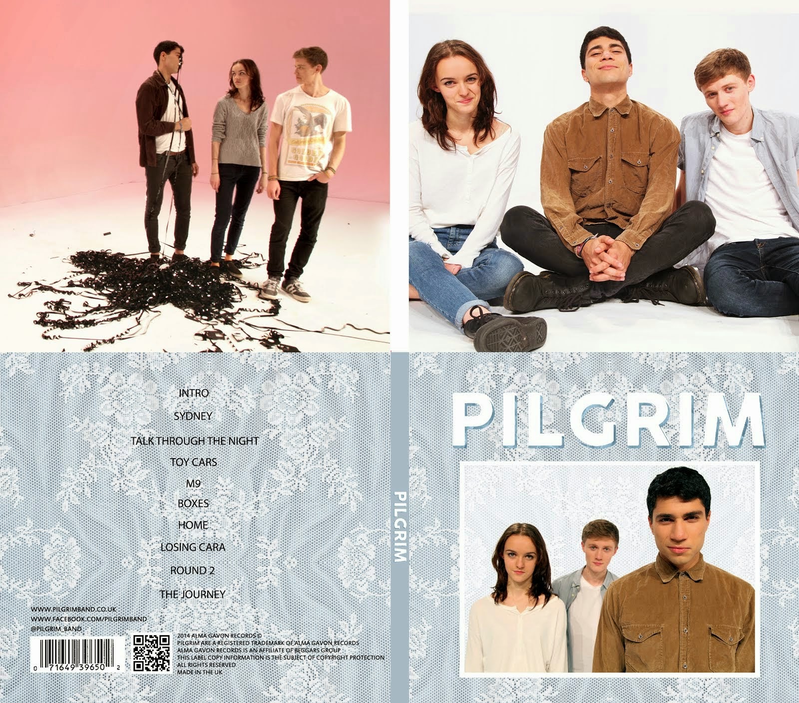
Digipack

Digipack
Our Digipack (Bottom Right, anti-clockwise: Front Cover, Back Cover, Left Inside Panel, Right Inside Panel)


Our Website (click to enter)


My name is Mahalia John (0345) and welcome to my A2 media blog.

I am part of Group 1 along with Alice Cahill (0130), Kayvon Nabijou (0610) and Gavin Fraser (0245).

You can navigate my blog using the right hand side column where you will find:

My A2 post labels including posts for the A2 Prelim, A2 research and planning and A2 Production

A live link to The Latymer School Music Video Blog

The blog archive of all my posts


Thank you for taking the time to look at my blog

Here is the live link to Group 1's Facebook Page

Friday, 25 October 2013

Sweded Project Summary

Alice, Molly and I sweded Christopher Nolan's film 'The Dark Knight Rises'. Here is a summary of the content we produced and our marketing strategy.

Trailer


This is a short 26 second trailer we made in order to promote our film. We posted it to our facebook and Twitter accounts and it now has over 100 views.

Poster


This is our promotional poster which we used on our various social media accounts. We based it on the posters for the original film but all the images are our own and it was made from scratch.

Exclusive Interview:


This is an interview with our main cast as an extra for our audience and to encourage them to engage in our film.

Social Media Links:

Twitter

Facebook

Final Film:

THE DARK KNIGHT RISES SWEDED

I have really enjoyed this project and working with my group. It was fun having to be resourceful as we were working on a zero budget.

Monday, 14 October 2013

Dexter Edit


Summarise the conventions of title sequences that were most important to this task
The purpose of a title sequence is to inform the audience who made the TV show/film and who is in it. There are many conventions of title sequences but some we had to consider more than others.

Font - The font is key as it has to match the themes and aesthetics of the film/TV show.


Colour - The colour of the titles cannot clash with the images in the sequence but it also has to stand out so choosing a colour is difficult.

Movement - The titles can be static but they can also move and interact with the moving images. For example in Zombieland where the actions of the characters affects the text.

2. How did your group plan to edit the title sequence? (consider timings, industry requirements etc).

We had very limited time to edit in so we set ourselves a realistic goal of 5 titles. There were three of us in the group and we took it in turns to create a title each. Before creating the titles we wrote out a list of where we wanted to place our titles in the sequence, we chose our favourite five and made those.

3. Explain the creative decisions made by your group.

 Font - We had to choose a font that reflected and matched the show. Dexter is about a serial killer who seems like a normal american civilian. Therefore we chose a sophisticated times new roman-esque font because it reflected the normal side of Dexter's character but the sleekness of it suggested something more sinister.

Colour - The title sequence was colourful so we decided to make our text white. This complemented the colours of the images and reflected Dexter's innocent appearance as a character.

4. How does your re-edit compare to the original?

The original is better as the creators of it were familiar with the show and had a lot more time to consider their creative decisions. Also the amount of time meant that they were able to create 23 titles compared to our 5. Having 23 titles meant there were no huge gaps without text which was a problem in our sequence. Their font was also a lot more masculine than ours which matched the show however I think our font and the original font both worked, even if it was for different reasons.

Sweded Research

'Sweding' is to remake a film or film trailer on a zero budget. They are usually under 4 minutes in length therefore have to represent the film in a clever way. Being so short they capture the essence of the remade film by using key/iconic scenes and dialogue.

A couple of my favourite sweded films:


The Dark Knight - I really like this one as it is so well made. A lot of effort has been put into make-up and props eg. they turned a kart into the batmobile.


Jurassic Park - I like this one because it uses humour. My favourite aspect is the fact that they wrapped two people in packing tape in order to turn them into velociraptors.


I think the Dark Knight Rises would be a good film to do as it has a lot of room for humour.


Sunday, 6 October 2013

Prelim Analysis


Brief: Plan, film and edit a continuity sequence that involved a character opening a door, crossing a room, sitting down in a chair and exchanging a couple of line of dialogue. It should demonstrate match on action, shot reverse shot and the 180 degree rule.


Who did you work with and how did you manage the task between you?

I worked with Gavin, Molly and Enya. We are all competent with the editing software and cameras as well as the creative aspects so we were able to work together well to plan, shoot and edit our sequence. We came up with our idea fairly quickly through a group discussion and rapidly got on with our planning. On our shoot we made sure each member of our team directed an equal number of shots and this continued into our editing where we switched every 10 minutes or so to make sure everyone got to use the software.


How did you plan your sequence? What theories did you take into account?

Together we came up with the idea of making a 'mock thriller' involving Gavin and myself. Once we had our concept we went to our chosen location and did a walkthrough in which we planned our action and what shots we were going to take of it. Next we drew up a storyboard which contained our shots, the action and our dialogue. When planning we considered narrative theory, genre conventions e.g. enigmas and low key lighting and continuity techniques such as match on action and the 180 degree rule.

What technology did you use to complete the task and how did you use it?

Hardware - We used a Sony Mini DV Camera, tripod, headphones and a shotgun microphone to shoot our sequence.

Software - We used Adobe Premiere Pro to edit and grade our sequence.


What factors did you have to take into account when planning, shooting and editing?

Permissions - We had to get permission to use our location.

Lighting - We wanted low key lighting so in the planning process we borrowed a camera and tested it to see how it looked in camera. We did this in case the room was too dark and we needed extra lighting.

Negotiating Spaces - Other groups were shooting in one of our locations and in hindsight this could have been managed better. We often interrupted each other's shots by accident which slowed us all down. In the planning process we should have created a shootboard and scheduled ourselves so that there were no location clashes.

Props - We wanted our sequence to be quite simple so we didn't use any extra props. However we did have to set up every computer screen in the room.

Working to time - We got all of our planned shots done within the allotted time however when shooting pickups we overran by about 5 minutes. This problem could have been solved by creating a shoot board in planning.


How successful was your sequence? In hindsight what would you have done differently?

In terms of filmmaking our sequence was successful as we obeyed rules such as the 180 degree rule and the 30 degree rule. Also we created match on action and used an SRS which was stated in the brief. Our story makes sense in terms of action (you understand what the characters are doing) and we didn't make any continuity errors.

However we did not stick carefully enough to the brief which stated that a character had to sit down and have a conversation with a character; Our sequence contained neither of these things. We should have looked over the brief once more after we'd finished planning to see if we'd missed anything.


What have you learnt from this task?

Group - I found that our group worked really well together but we should ahve been more vigilant when it came to the brief.

Planning - group discussion is the key to planning and we did this well. However the use of a shoot board would have helped us with timing and location clashes.

Shooting - I learnt more about the camera and its strengths as well as its limitations. Also we found that were were able to shoot the same thing from different angles within the time limit.

Editing - We had a session recapping how to use Adobe Premiere Pro which refreshed my memory of the software and helped massively.

I will carry what i've learnt into the rest of my coursework as our film openings will be made with a similar process to this.

Wednesday, 2 October 2013

AoT Grid Analysis


Summarise your film idea

Our film 'immolere' is a horror about a serial killer who is cast out by a group of friends and sets out to murder each one of them finishing with the ring leader. Our film opening starts with the investigation of the murder of one of the group.


What kind of information has been included in your film opening?

Characters - The Antagonist (the killer), the group of friends and our protagonist (the ring leader) have all been introduced through images of them.

Genre - Horror is connoted through the low key lighting, knives, disturbing imagery (girls with crosses over their faces) and the images of a corpse.

Concept - The murder of a group of girls is suggested because the first image is of a group of girls and there are shots of corpses and knives.

Cast and Crew

Title - 'immolere'


How do the titles link to the main film idea?

- The shot of knives laid out in a row links to the serial killer in our film.

- Our characters are shown in photos with their faces crossed out.

- The corpse is one of the killer's victims.

- Our title 'immolere' is a latin word meaning to kill by ritual sacrifice.


Summarise the expected audience reaction

We intend to scare or unsettle our audience because our genre is horror. We have given our audience some information such as the concept but have created many enigmas which make them want to keep watching. We created enigmas through Low Key Lighting and not showing the antagonists face. Our opening is incredibly ambiguous and by the end of it the audience should be hooked by the story and want to keep watching.

Identify 3 things in your grid that are important in an opening sequence

1. Titles

2. Introduction to character

3. concept and genre


How effective is your project as a film opening?

- I think our project is effective as it quickly connotes the genre and applies the conventions of a film opening title sequence.

- In hindsight I probably would have shot in more detailed locations so we could have had establishing shots.