Our Music Video


Our Music Video

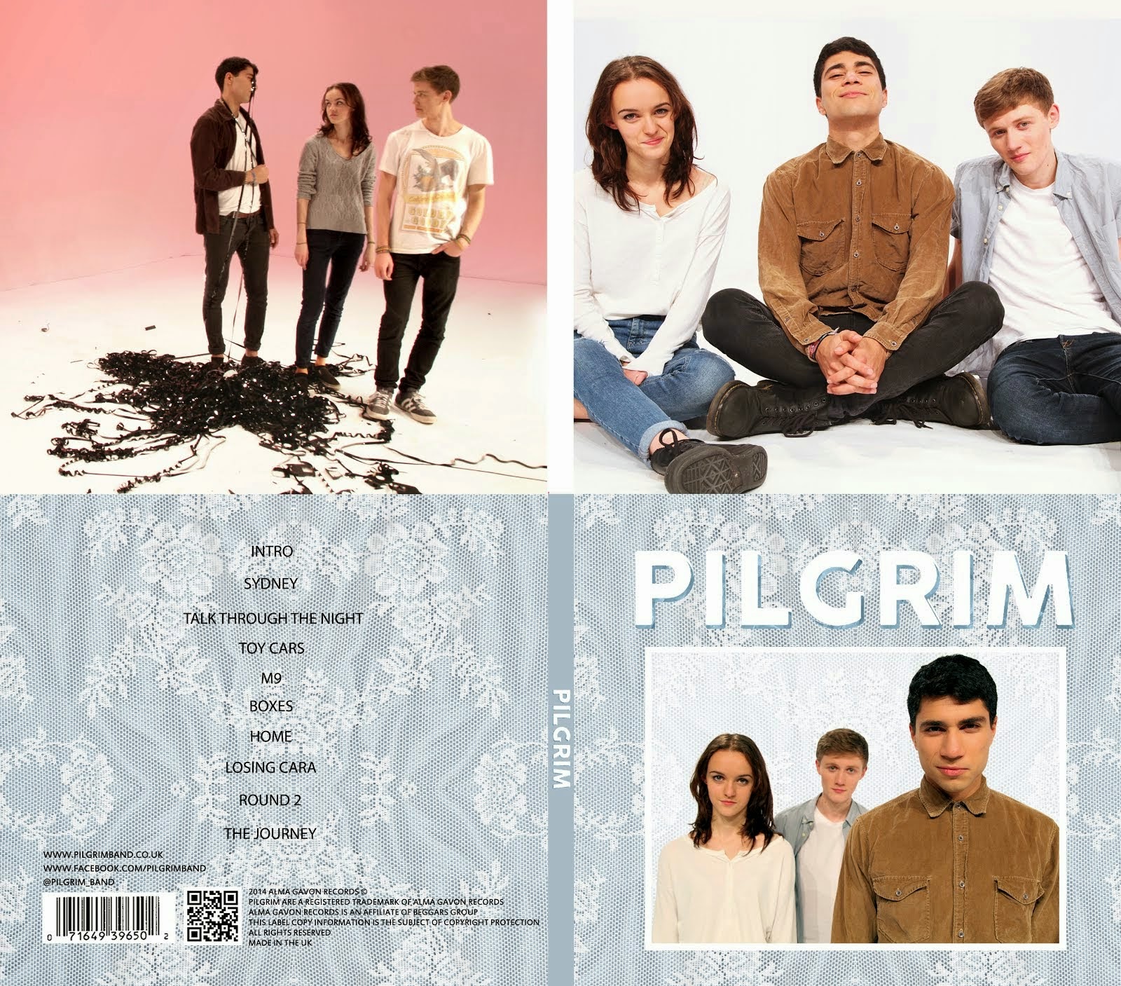
Digipack

Digipack
Our Digipack (Bottom Right, anti-clockwise: Front Cover, Back Cover, Left Inside Panel, Right Inside Panel)


Our Website (click to enter)


My name is Mahalia John (0345) and welcome to my A2 media blog.

I am part of Group 1 along with Alice Cahill (0130), Kayvon Nabijou (0610) and Gavin Fraser (0245).

You can navigate my blog using the right hand side column where you will find:

My A2 post labels including posts for the A2 Prelim, A2 research and planning and A2 Production

A live link to The Latymer School Music Video Blog

The blog archive of all my posts


Thank you for taking the time to look at my blog

Here is the live link to Group 1's Facebook Page

Friday, 27 September 2013

Film Opening Narrative Analysis


Establishing Shot - Establishing shots are used to connote the setting eg. the WS of  skyscrapers and buildings at the beginning. In this case the setting is a bank in Gotham City.

Match On Action - There is a lot of action in this sequence so match on action is key. An example is in the first shot a window get blown out and the sequence then cuts to an MCU of a masked man who has just blown the window out. The purpose of match on action is to make sure the narrative flows and does not confuse the audience by not making sense.

Use of shot order - More often then not this sequence cuts from close shots to mids to longs and then back the other way. This creates narrative flow as jumping from close shots to longs or using jumps cuts jars the audience.

Cross cutting - The sequence cuts between the armed robbers on the roof who then disarm the alarm and break into the vault and the robbers who hold up the bank. These two parallel story lines both add to the flow of the story as the audience reads them as happening simultaneously.


Accident Sequence


What techniques did you use to create narrative flow in your sequence?

Master Shot - Our second shot was a WS pan from one character to another, this helps the audience to understand where objects and characters are in relation to eachother. It also established our football field setting.

Reverse Shot - Our third and fourth shots were ECU reverses of the characters faces. It established the characters of a confident football player and a scared, incompetent goal keeper.

Match on Action - When the footballer kicked the ball out of frame it came back into frame in the next shot on the same side and was edited so that it seemed the ball flowed from one shot into another.

180 degree rule - We obeyed the basics of video editing by following the 180 degree rule. We didn't cross the line between our two characters. This meant that the narrative flowed and there were no jarring or confusing moments for our audience.


What could you do to improve the narrative flow in your sequence?

Our first shot is a CU of a pair of feet stepping up to a football but there is no context, character or setting so the audience become confused. In hindsight, I would have put this shot later on in the sequence.

Thursday, 19 September 2013


This is the opening sequence for Drive (2011).

Drive is a thriller about a getaway driver who lands himself in trouble when he decides to help out a neighbour.

Almost instantly the film reveals its setting of LA, through the character's dialogue and the map of the city. The low key lighting and the character talking about a robbery establish the film as a thriller.

In the first scene the protagonist 'Driver' is introduced, his dialogue is calm and to the point, even though he is in a dangerous situation, this is a reflection of his character. The character 'Driver' is extremely enigmatic, he has fewer lines than most protagonists and his face is usually void of emotion. A key example of this is in the getaway; he remains extremely calm in a highly tense situation and he is well practiced at getaway driving which raises lots of enigmas such as 'How did he get into getaway driving?' and 'Why is he so good at it?'. The mis-en-scene of his apartment adds to this image of him as it contains very few possessions.

The getaway scene is a great example of executing set pieces smarter. In a big hollywood blockbuster the getaway would be a high speed chase across the desert ending in an explosion. The director Nicolas Winding-Refn uses his smaller budget ($13 million) very cleverly. The music is pulsating and almost mimics a heartbeat which heightens the tension along with the contrasting composures of the characters: Driver is calm and confident but the robbers in the passenger seats are tense and jumpy. The whole scene has low key lighting which is a convention of thriller films. The editing in this scene is all straight cuts but it is not fast paced which reflects Driver's calmness. The scene uses lighting, music and character to create tension.

The story starts by introducing the protagonist and straightaway it is revealed that he is a getaway driver because of his phone conversation and him going to collect the car. At the end of the getaway Driver escapes by disguising himself as a baseball fan this suggests he is clever. The credits are shown over shots of Driver driving around LA at night.

Reflections on Shots


Describe your shot and identify in what way it could be described as representing your chosen genre

My shot is an MCU of a male character glaring at the camera; the closeness of the shot makes the audience feel vulnerable. It features low key angled lighting which casts shadows across his face creating enigmas because it hides information. The genre is horror connoted by the character's unforgiving expression, the low key lighting and the lack of information in the shot.

What did you do to achieve the effect?

I asked my actor to stand close to the camera and glare into the lens. I then positioned a small light to the bottom left of the frame and angled it so that it would cast shadows across his face.

What is successful about your shot?

The lighting effect works really well as it is positioned to show his face but not too much of it that there are no enigmas. Also the tight framing does well to make the audience feel uncomfortable as the character is so close.

What would you do differently?

In hindsight I probably would have positioned the light so that the character's shirt was not lit as the image would be stronger if it was just a face emerging from the shadows.